Untapped potential of data lineage
Data lineage diagrams proliferated data tools as a default way to visualize how data flows. But what if there is a better way to find your way around?
When scaling a company, teams gradually add new data sources, pipelines, data models, and dashboards to fulfill the surging demand for data. With every addition, their data ecosystem gets more complex, and as the team scales beyond the initial few, no one can keep an overview of how it all works anymore.
The data tooling industry has the answer: Data Lineage, which shows how data tables, models, or dashboards are tied together.
But it has its limits.
Data lineage at scale
Data is a digital flow of information. It is created in tools across the business and moves through layers of transformations before reaching the decision-maker (a human or a machine). A data lineage chart is a natural visualization to show how data flows from its source to its destination.
Not too far ago, such a view was a privilege of enterprise companies—teams had to piece lineage together by declaring data dependencies manually. With the rise of the modern data stack, it changed. Lineage got commoditized by parsing SQL code—on table or column level— or consuming preprocessed metadata, such as dbt artifacts. For today’s data tools, lineage has become table-stakes.
However, despite its broad presence across the data ecosystem, it has one big challenge:
The lineage looks very clear with a few tables. But it becomes difficult to use when data scales. What used to be a clear overview turns into a visual maze.
Even this lineage with about ~100 tables/models (light blue boxes) and ~30 sources (green boxes), can start to look overwhelming:
Especially if our goal is to find things. Here are a few typical questions I’ve had as part of my daily work in the past:
Which tables have the most downstream dependencies?
What are the exact downstream dependencies of a given source?
What are upstream dependencies filtered by some criteria?
How many sources are upstream from a given model?
And more.
I could answer all these questions using the lineage view, but I had to do the work by visually scanning the interface. As the system grew, I had to do more work, proportionally to the growing size of the system.
That doesn’t scale well.
Learnings from Google Maps
When I was a little child, I loved maps. I could spend all evening browsing through pages of the atlas of the world. Not looking for anything specific, just browsing.
Let's apply this to our ordinary day-to-day life.
Think about your city. It's full of options for buying groceries, going for cocktails, playing sports, buying garden tools, going to restaurants, parks to hang out, etc. Some are near, some are far, some are available now, and some are not. It’s hard to fully understand, especially if you don’t know your city entirely by heart.
As you go about your day, from time to time, you get to the point when you need something you’re not entirely sure where it is.
Like when you’re on your way home from your office, if you’re like me, you might realize at the last minute that there is nothing at home for dinner. You need groceries! Let’s find a shop that is not too far and open now.
What do you do?
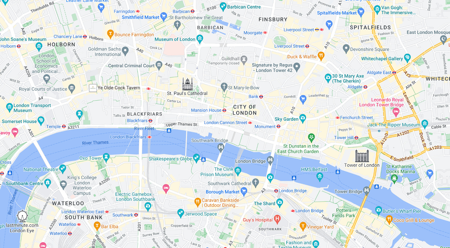
You go to Google Maps and open a beautiful map like this:
After you familiarize yourself with it, you will notice the grocery shop-the blue icons. With a bit of scrolling to move, pinching to zoom, and hovering to find the opening hours and popularity, you can finally choose Sainsbury’s.
Except … you don’t do that, do you? Using maps this way is hard!
Instead, you do this:
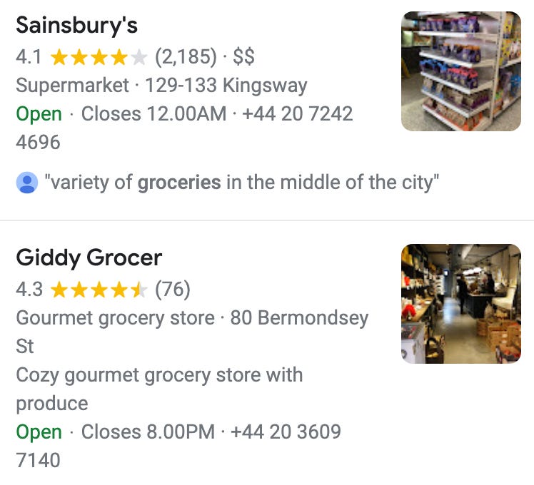
And you expect a prioritized list of grocery shops as a result:
That’s simple. Just a list of shops. Sainsbury’s it is!
Graph—the underlying superpower
Google Maps and Data Lineage have two critical things in common. We can render both visually for the user to explore or search them as a graph programmatically.
Suppose we have operated with a system we spoke about earlier, a hundred data models and two dozen data sources like this:
And we want a list of data sources upstream from a given node (the green boxes on this chart).
We can start scrolling and zooming in on the above view, but that doesn't seem the most efficient way.
Instead, we could use an experience like searching for a groceries shop. We describe what we want to find:
And get a list of sources as a result. Yep, just a simple list again.
Like maps, we can model data lineage as a graph. It’s very natural. The nodes represent tables, dashboards, or columns, and edges represent dependencies. The graph is directed and acyclic.
To execute our query, we pick a node to start from, define constraints on nodes and edges we want to traverse, and run. The query engine will do the heavy work; there is no need to render any graph on the screen, asking users to do the job visually.
The answer to our questions about sources could be found in 100 milliseconds as a graph search instead.
The critical value of data lineage is its ability to facilitate a query to find the right things. The real power is the graph search, not the visual chart.
In today’s tools, data lineage potential is untapped. Except for a few filters, the lineage experiences are not designed to find things; they are designed to show things. That’s a big difference.
Path forward
Maps used to be the way to find things around us. But with the arrival of search, powered by map data, we can find anything much faster.
Similarly, using a lineage chart to find things feels like a start, but we should have bigger ambitions—similarly to what Google did with maps.
We should invent much better lineage search tools to empower data people to be more productive by finding things faster.
A search brings many substantial benefits:
It scales well. Searching dependencies in a project with thousands of models is fine. Looking for a single node on this large lineage chart is a challenge.
It is precise. The search is exact. There is less room for error by accidentally skipping a critical node that we oversaw in the lineage.
It is familiar. We know how search works—write a query and get a list of results. Compared to lineage, we are deeply familiar with how it looks.
It has a higher information density. Search results can display rich metadata. Cramming this to data lineage is overwhelming.
It is fast. Search executes much quicker than any human can scan the UI visually.
It can run in parallel. We could run ten search queries simultaneously. We can only view one lineage chart at a time.
—
And the long shot? What if we could execute searches proactively, behind the scenes, surfacing relevant information about upstream and downstream data assets depending on our current workflow?
Let’s geek out about the future of data lineage and what the search experience could look like. Drop me a note. Images originate from dbt & Google Maps.


I can totally relate to what you describe here ... I have never found the lineage representations in the metadata tools to be very helpful. It feel like gimmickry to convince management but not the solution you need in your engineer's toolbelt to effectively navigate the complexity of your data reality. A search based tool with data lineage operators/verbs is indeed the solution ("search over navigation", right?).
But would it be so simple to dump the dataset in a graphdb like Neo4j and be over with it?